Signing up to fundraise should be simple. Someone decides to support a cause, create a page, and share it with their network.
Momentum P2P is a peer-to-peer fundraising platform that enables individuals to create personal campaign pages and raise money for nonprofit organizations.
A significant number of users were dropping off during registration before they ever became fundraisers.
Not because they didn’t care but because something in the experience made it easier to leave than to continue. The problem wasn’t attracting users, it was losing them at the moment they were ready to commit.
This project focuses on that moment and how small points of friction can break momentum before it ever turns into action.
Product Designer
Figma
Feb - May 2022
Analytics from a partner organization showed a consistent pattern: nearly 35% of users were starting registration and not finishing it.
This wasn’t just a usability issue. It meant potential fundraisers were dropping off before they ever entered the platform.

At a system level, the gap became clear: people were motivated enough to start but something in the experience was stopping them from finishing. This meant that the product wasn’t failing to attract users, it was failing to convert them.
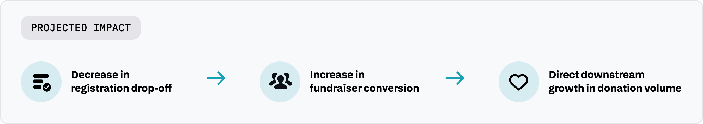
And that created a direct opportunity: If we could help more users complete registration,
we could directly increase the number of active fundraisers and the donations that follow.
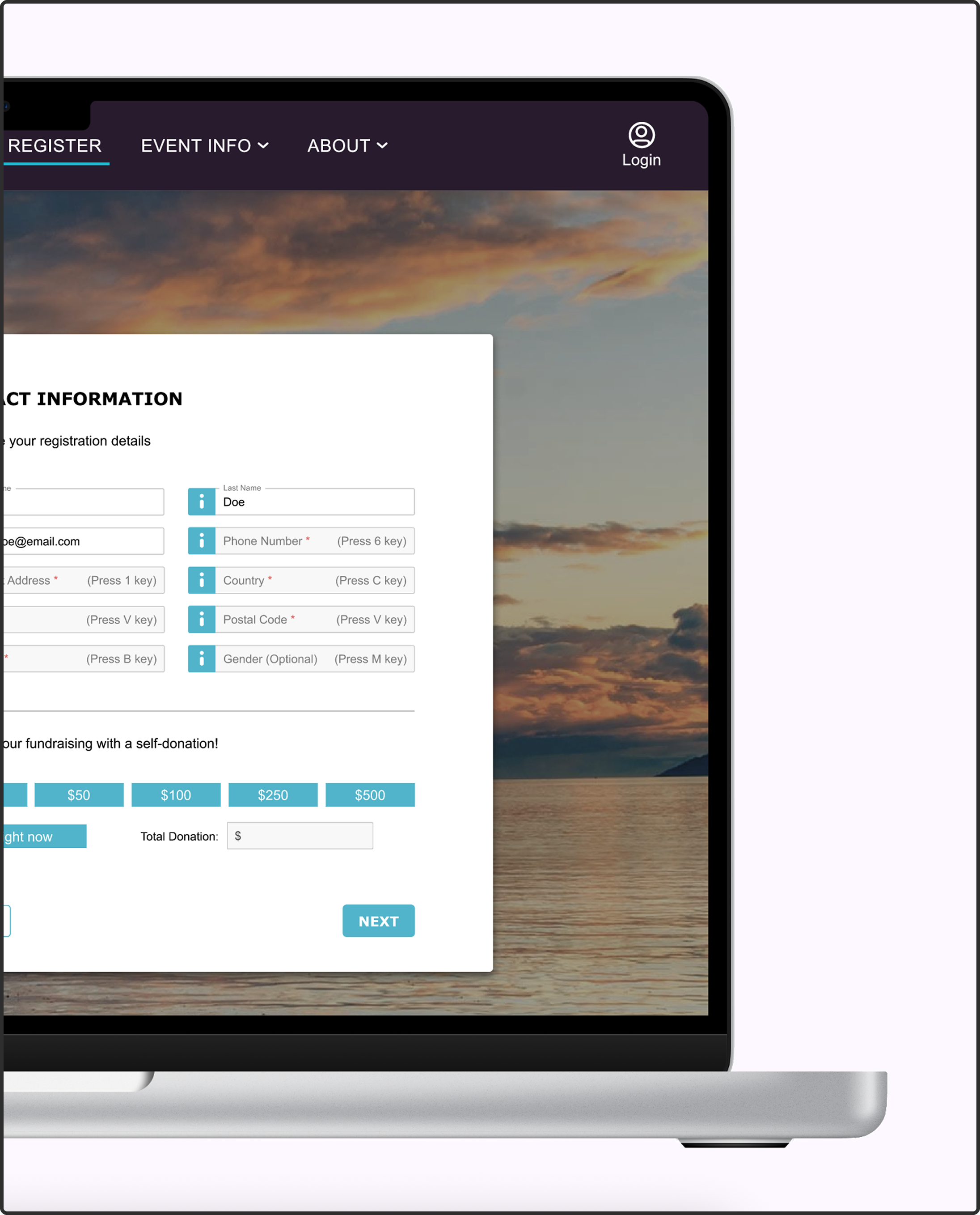
Initial review of the experience revealed no single failure point. Instead, the drop-off was driven by compounding friction across the flow. Users encountered:

Individually, each issue was tolerable. Together, they created a pattern: the experience made a relatively simple task feel long, uncertain, and easy to get wrong.

After identifying where users were struggling, I needed to understand why those moments were causing drop-off. I used Nielsen’s usability heuristics to evaluate the flow and map each friction point to a deeper structural issue. This revealed that the experience was breaking down in four key ways.
This reframed the problem:
The issue wasn’t the amount of effort required, it was the lack of structure, clarity, and control around that effort.
The goal wasn’t to simplify the form, it was to make the process feel easier to complete. Success meant more users completing registration and ultimately, more fundraisers entering the platform.
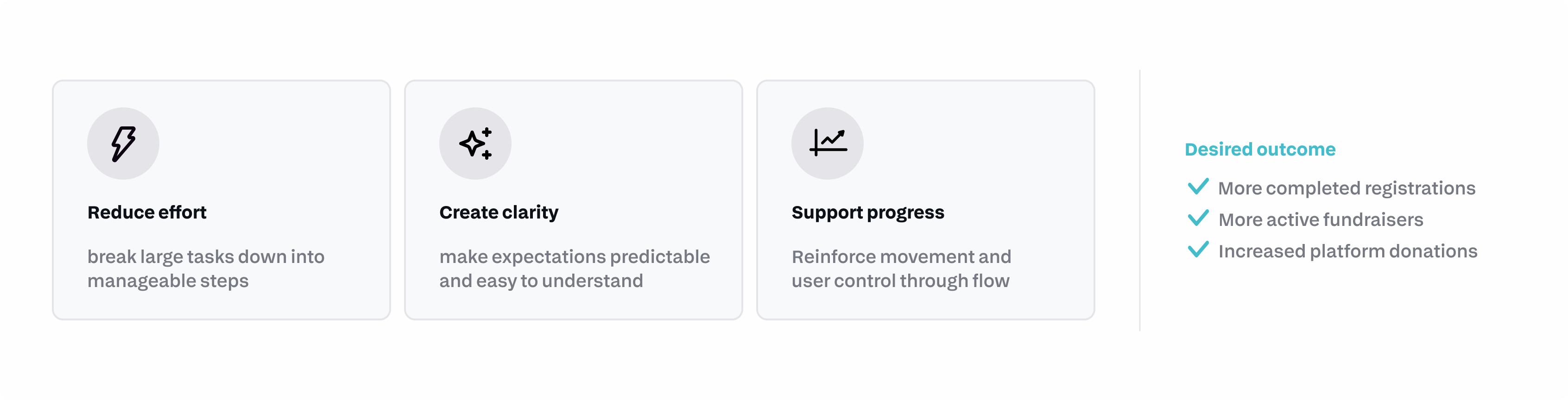
Instead of optimizing individual elements, I restructured the flow to change how the entire process was experienced. The redesign focused on three principles:
Make progress visible
Make effort feel manageable
Restore a sense of control


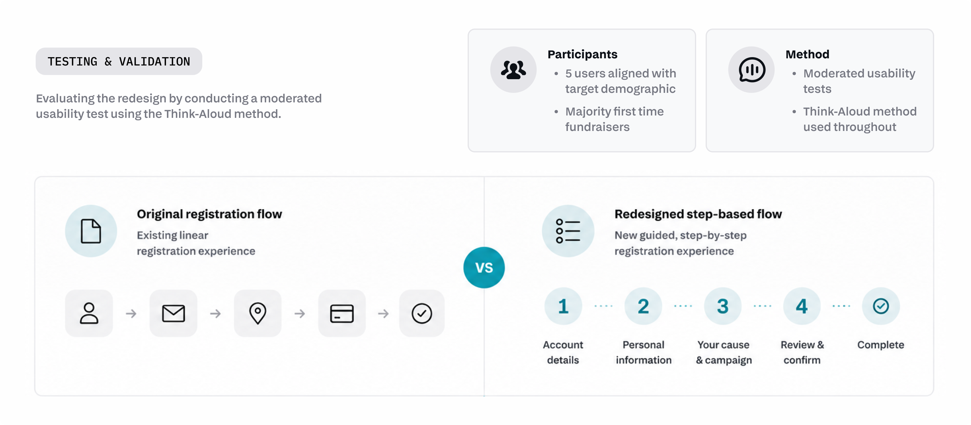
To evaluate this redesign, I conducted moderated usability tests using a Think-Aloud method. This allowed for a direct comparison between how users experienced both versions of the process.
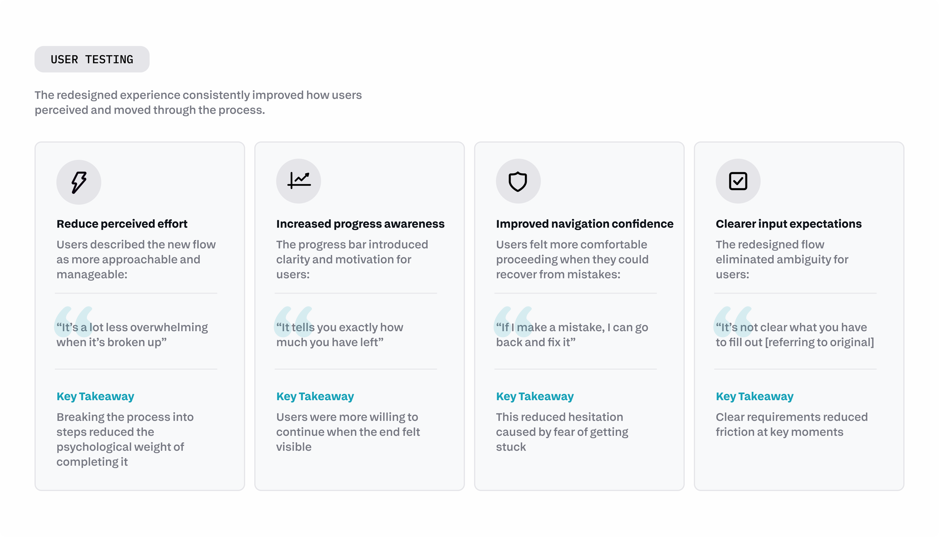
The redesigned experience consistently improved how users perceived and moved through the process.
The redesign didn’t reduce the amount of work required, it changed how that work was experienced.
By making progress visible, clarifying expectations, and restoring control, the process shifted from something users hesitated to complete into something they could confidently move through.
While live metrics weren’t available due to project constraints, usability testing showed clear improvements in how users experienced the registration process
This project reframed how I think about product impact. What initially appeared to be a simple form revealed itself as a critical leverage point in the system, where small moments of friction compounded into meaningful loss.
It reinforced that:
Onboarding is not a peripheral experience, it is a conversion engine
Perceived effort can outweigh actual effort in shaping behaviour
Structural clarity often matter more than visual polish
By making effort visible, breaking complexity into manageable steps, and restoring user control, the experience became something users could confidently complete and unlocking participation at the very start of the funnel.